You’ve seen it. You’ve probably used it this morning. Whether you were drafting a legal brief, finishing a college essay, or just squinting at a government PDF, Times New Roman was likely there, staring back at you with those sharp, familiar feet. It’s the comfort food of typography. Boring? Maybe. Efficient? Absolutely. But what most people don't realize is that this wasn't some organic creation of the digital age. It was born out of a nasty insult and a very specific deadline in 1930s London.
The Grudge That Changed Typography
It started with a complaint. Stanley Morison, a typographic consultant for the Monotype Corporation, spent a good chunk of his time criticizing the The Times of London for their subpar printing quality. He basically told them their newspaper looked like it was stuck in the 19th century. Instead of getting defensive, the management at The Times essentially said, "Fine, if you're so smart, you fix it."
Morison took the bait. He teamed up with Victor Lardent, an artist from the paper’s advertising department, to create a typeface that could handle high-speed printing presses without becoming a blurry mess. They needed something narrow—to save space and money—but incredibly legible. They looked back at older "Old Style" fonts like Plantin but sharpened the edges. On October 3, 1932, the Times New Roman alphabet officially debuted in the newspaper. It was a hit. It looked crisp. It looked authoritative. It looked like the future of news.
Why Is It Everywhere Now?
If you were around for the early days of personal computing, you know Microsoft is the real reason this font became the global default. When Windows 3.1 rolled out, Times New Roman was selected as the core serif font. Because it was the default, people just... used it.
It became the "professional" choice by sheer momentum. If you send a resume in Times New Roman, nobody thinks you're a rebel, but nobody thinks you're a clown either. It’s safe. It’s the suit-and-tie of the font world. Honestly, it’s kinda impressive how a font designed for cheap newsprint survived the jump to high-resolution 4K monitors without losing its identity.
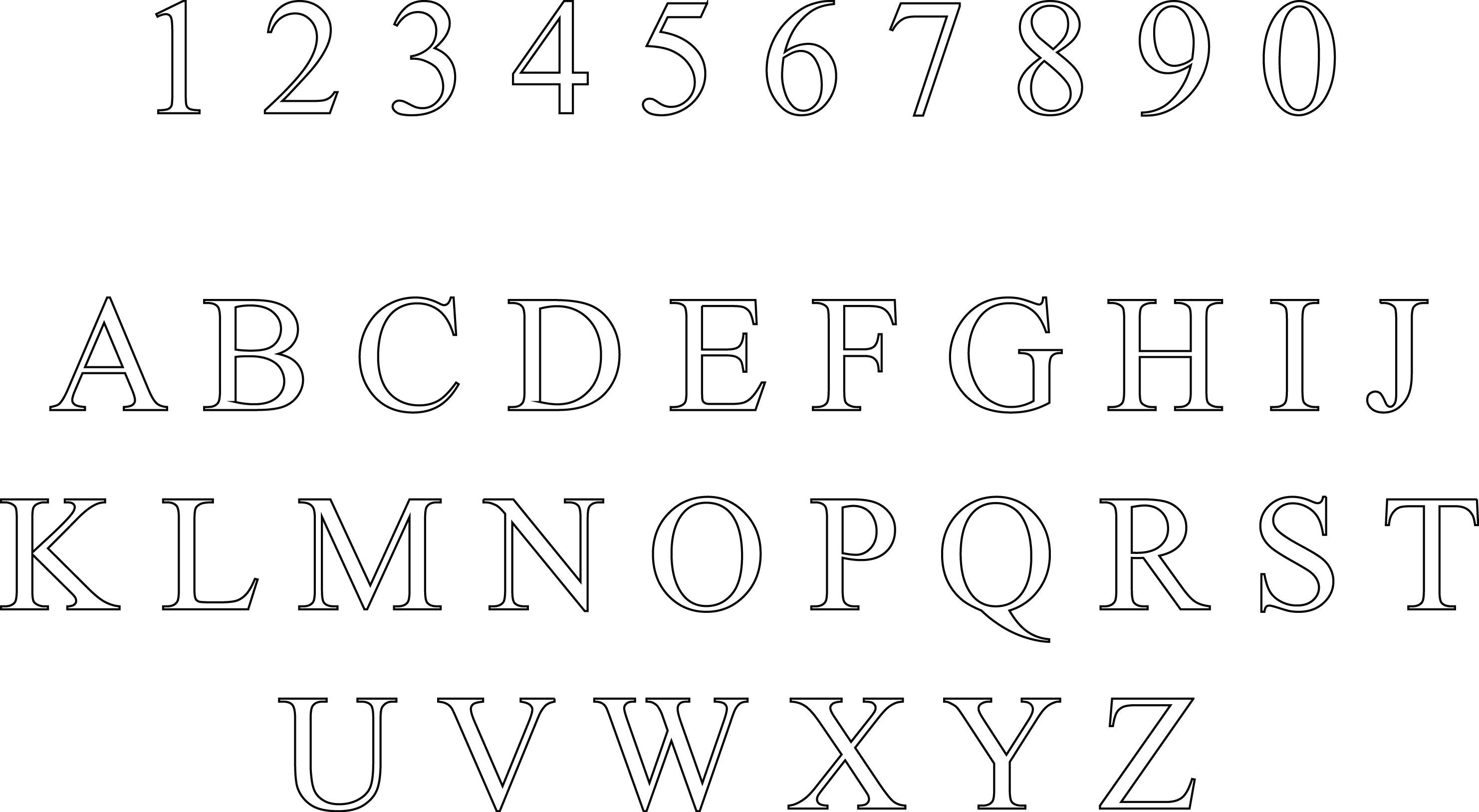
The Anatomy of a Workhorse
What makes the Times New Roman alphabet actually work? It’s all about the contrast. The thick and thin strokes are balanced just enough that your eye doesn't get tired. The serifs—those little "feet" on the ends of letters like 'n' and 'r'—help lead the eye from one letter to the next. This creates a horizontal flow that makes reading long blocks of text easier on the brain.
- The 'g' factor: Look at the lowercase 'g' in Times New Roman. It has that distinctive "loop" on the bottom. It’s classic.
- The 'a' curve: The top of the 'a' has a very specific hook that feels intentional and sturdy.
- Space efficiency: Because it was made for newspapers, the letters are slightly condensed. You can fit more words per line than you can with something like Georgia or Baskerville.
This efficiency is a double-edged sword. Students have spent decades trying to use Times New Roman to hit page counts, only to realize that it’s actually too efficient. If you want your paper to look longer, you usually have to switch to something "fluffier" like Courier New.
The Great Serif Debate: Is It Dying?
Around 2007, things changed. Microsoft swapped the default in Word from Times New Roman to Calibri. Then later to Aptos. The world moved toward "Sans Serif" (fonts without the little feet) because they generally look cleaner on low-resolution smartphone screens.
Does this mean the Times New Roman alphabet is over? Not even close. In the legal world, it’s still the king. The U.S. Supreme Court actually requires certain documents to be printed in specific sizes and styles, and for a long time, Century Schoolbook and Times New Roman were the heavyweights. However, interestingly, the U.S. State Department recently moved away from it, citing accessibility reasons. They prefer fonts like Calibri or Arial because they believe the lack of serifs helps people with visual impairments or dyslexia distinguish letters more clearly. It was a huge blow to the font's ego, if a font can have an ego.
It’s Not Just One Font
When we talk about this alphabet, we aren't just talking about one file on your computer. There are dozens of variations. You have Times New Roman PS, Times New Roman MT, and even "Times" (which is the version Apple uses). Because the font was so popular, everyone wanted a piece of it. Monotype and Linotype both had versions, and they weren't exactly identical. If you look closely at the spacing in the bold weight, you can see slight differences in how the letters "hug" each other.
How to Use It Without Looking Lazy
Most people use Times New Roman because they didn't bother to change the setting. If you want to use it and actually look like a pro, you have to pay attention to the details.
- Stop using 12pt for everything. Try 11.5pt or 11pt. It looks much more sophisticated and less like a high school homework assignment.
- Adjust the leading. Leading is the space between lines. Adding just a tiny bit of extra air between rows of text makes Times New Roman look like a premium book font instead of a cramped newspaper.
- Pair it with a bold Sans Serif. If your body text is Times, make your headers something thick and modern like Helvetica or Montserrat. The contrast between the old-school serif and the modern header is a classic design trick that never fails.
The Weird Cultural Legacy
Times New Roman is basically the "neutral" setting of the human mind. It’s been used for everything from The New York Times (obviously) to the labels on jars of expensive mustard. It carries a sense of "truth." In studies where people were shown the same statement in different fonts, statements in Baskerville or Times New Roman were often perceived as more "believable" than those in informal fonts like Comic Sans. We associate these shapes with history, academia, and the law.
But it’s also the font of the "Status Quo." If you’re a creative director at a tech startup, you probably wouldn't touch this font with a ten-foot pole. It feels too "establishment." It feels like your dad’s printer. Yet, in a world of trendy, bubbly fonts that disappear after six months, there’s something genuinely cool about a typeface that hasn't changed its basic DNA in nearly a century.
Actionable Steps for Using Times New Roman Effectively
- Check the Requirements: If you are submitting a legal or academic paper, check the style guide first. Many still mandate the Times New Roman alphabet for consistency, even if it's no longer the default in Word.
- Hierarchy is Key: If you use it for body text, ensure your headings are at least 4-6 points larger to create a clear visual break.
- Print vs. Digital: Use it for long-form reading that will be printed. It shines on paper. For mobile-first websites, consider using a serif font specifically designed for screens, like Tiempos or Lora, which mimic the feel of Times but are built for pixels.
- Avoid the "Wall of Text": Because this font is compact, your paragraphs can look denser than they really are. Use shorter paragraphs and frequent subheadings to keep the reader from getting "eye fatigue."
Times New Roman isn't going anywhere. It’s the foundation of modern typesetting, a relic of 1930s London that somehow conquered the digital world. Whether you love it for its clarity or hate it for its ubiquity, it remains the most successful typeface in history. Use it wisely, and it’ll give your work a gravity that few other fonts can match.
The next time you open a document, take a second to look at those little serifs. They aren't just decoration; they are a direct link to the history of the printing press and the evolution of how we share information.