Honestly, the internet is a weird place. Sometimes it's just a void of shouting, but back in April 2019, it became a unified, screaming force of nature. If you were online then, you remember the trauma. Paramount dropped the first trailer for the Sonic the Hedgehog movie, and the world collectively recoiled. The original sonic live action design was... well, "cursed" is the word most people used. It wasn't just that it looked different from the Sega games. It felt like something out of a fever dream that didn't quite understand how biology—or nostalgia—actually works.
We’re talking about a blue hedgehog with human teeth. Human. Teeth.
It's rare for a multi-million dollar studio to look at a completed trailer, listen to the internet's visceral disgust, and say, "Yeah, okay, we messed up." But that's exactly what happened. Jeff Fowler, the director, took to Twitter almost immediately to promise a redesign. It was a historic moment in film marketing. Usually, studios dig their heels in. They blame the fans for being "toxic" or tell people they just don't get the vision. Not this time. They knew that the original sonic live action design was a fundamental miscalculation of what makes a character iconic.
The Design Choice That Defied Logic
Why did they do it? That’s the question everyone asked.
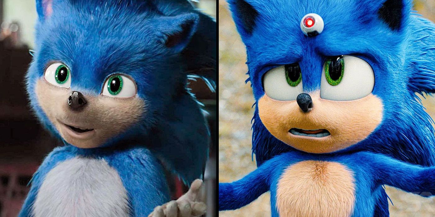
The original look tried too hard to be "grounded." The designers wanted Sonic to fit into a real-world setting alongside James Marsden. This meant giving him realistic fur texture, which was fine, but they also gave him small, beady eyes and a terrifyingly muscular, human-like torso. Instead of the classic noodle-arms and big gloves, we got white-furred hands that looked like actual paws.
And then there were the proportions.
The original sonic live action design abandoned the "rubber hose" animation style that makes Sonic work. By trying to make him a "realistic" alien, they landed squarely in the Uncanny Valley. That’s that creepy place where something looks almost human, but just "off" enough to trigger a biological fight-or-flight response. Seeing those human molars inside a blue snout was the breaking point for most fans. It didn't look like Sonic; it looked like a child in a very expensive, very terrifying mascot suit.
The Impact of the Uncanny Valley
Evolution has programmed us to be wary of things that look "wrong." When a character has human-like eyes and teeth but a distorted body, our brains flag it as a threat. It’s why some people are scared of porcelain dolls. The original sonic live action design leaned into this accidentally. By shrinking the eyes—which are the most expressive part of Sonic's game design—they robbed the character of his personality. He looked vacant. Scary, even.
The $5 Million Gamble
When Paramount announced the delay, moving the release from November 2019 to February 2020, the industry held its breath. People assumed it would cost tens of millions to fix. Reports later suggested the price tag for the redesign was closer to $5 million, though some estimates vary depending on how much marketing material had already been printed.
Tyson Hesse, a fan-favorite artist who had worked on Sonic Mania, was brought in to lead the charge. This was the smartest move the studio made. They stopped listening to "market research" about what a live-action alien should look like and started listening to people who actually understood the character's silhouette.
They basically went back to basics:
- They enlarged the eyes to give him back his expressive range.
- The human teeth were hidden unless absolutely necessary for a gag.
- The "Nike-style" sneakers were replaced with the classic red power sneakers.
- The lanky, muscular limbs were shortened and smoothed out.
It worked. When the second trailer dropped, the vibe changed instantly. The internet went from mocking the film to rooting for it. This wasn't just about aesthetics; it was a PR masterclass in how to handle a catastrophic blunder.
Why This Matters for Future Video Game Movies
For a long time, there was a "video game movie curse." Super Mario Bros. (1993) was a nightmare. Street Fighter was a mess. The common thread was usually a director or a studio that felt they were "above" the source material. They felt the need to "fix" the designs to make them more "cinematic."
The failure of the original sonic live action design proved that you can't outsmart decades of character branding.
Sonic’s design hasn't changed much since 1991 for a reason. It’s a perfect silhouette. When you mess with the fundamental geometry of an icon—the single eye-bridge, the oversized shoes, the specific shade of cobalt—you lose the soul of the character. The "ugly" Sonic was a symptom of a studio trying to satisfy a checklist of "realism" instead of capturing the energy of the IP.
The "Ugly Sonic" Legacy
Interestingly, the original sonic live action design didn't just disappear into a digital shredder. In a weirdly meta twist, the design reappeared in Disney’s Chip 'n Dale: Rescue Rangers (2022) as "Ugly Sonic." He was voiced by Tim Robinson and portrayed as a washed-up actor living in the Uncanny Valley.
It was a brilliant bit of self-deprecating humor from the industry. It acknowledged that the design was a mistake while giving it a permanent, funny place in pop culture history. It turned a potential franchise-killer into a punchline that everyone—including the studio—could laugh at.
Lessons Learned from the Sonic Debacle
If you’re a creator or someone working in branding, the Sonic saga is a textbook case study. Authenticity beats realism every single time.
- Listen to the core audience early. You don't have to design by committee, but if 99% of your target demographic says "this looks like a sleep paralysis demon," they’re probably onto something.
- The "humanizing" trap. Adding human features to non-human characters rarely makes them more relatable. Usually, it just makes them weirder.
- Proportions are everything. Sonic’s speed is visual. The original lanky design made him look slow and heavy. The revised, rounder design made him look aerodynamic and energetic.
The movie ended up being a massive hit, spawning sequels and spin-offs. It’s arguably one of the most successful video game adaptations ever made. But none of that would have happened if they had stuck with the original sonic live action design. It would have been a one-and-done curiosity, a footnote in the history of bad CGI. Instead, it became a story of redemption.
Actionable Takeaways for Design and Branding
- Test your "Uncanny Valley" threshold. If you're creating a mascot or character, run it through a "creepiness test" with people outside your immediate creative circle. If they focus on the teeth or the eyes, you've gone too far toward realism.
- Respect the Silhouette. An iconic character should be recognizable by their shadow alone. The original 2019 design failed this test because its proportions were too generic and human-like.
- Be Prepared to Pivot. Paramount's willingness to spend $5 million saved a franchise worth hundreds of millions. Sometimes the most expensive mistake is the one you refuse to fix.
- Study Tyson Hesse’s Work. If you want to see how to translate 2D icons into 3D spaces, look at the transition between the two Sonic trailers. It’s a masterclass in maintaining character "soul" while adding texture.
The "Ugly Sonic" incident remains a landmark event in digital effects. It proved that in the age of social media, the feedback loop between creators and consumers is shorter than ever. While we might not want every movie directed by Twitter polls, in the case of the original sonic live action design, the internet was 100% right.